Types of Logos: An Essential Guide for Modern Businesses
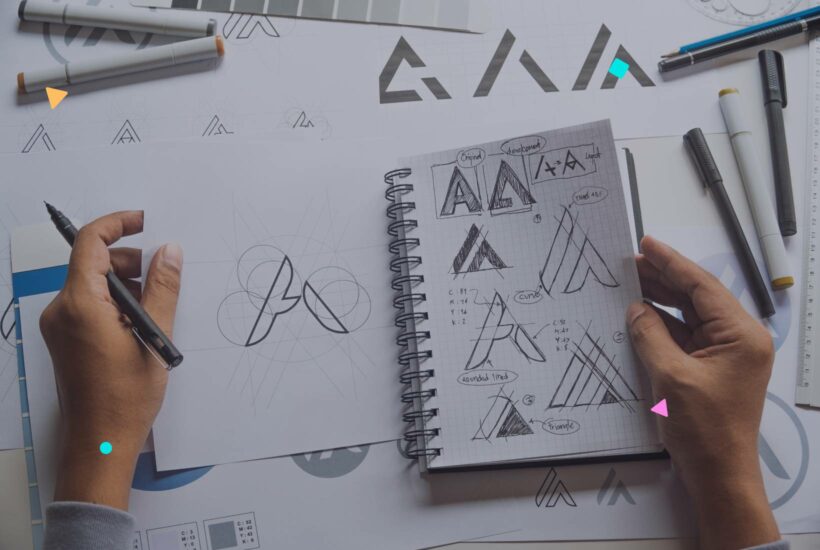
Between lights and shadows, every company seeks a signal that sets it apart, an emblem that encapsulates its essence and projects it to the world. Logos are that beacon on the market’s horizon, that gleam which, when well-designed, can become a magnet for attention. It’s not just design; it’s visual storytelling. Join us on this journey through the types of logos and discover which one is the perfect reflection for your business’s history and ambition.
Tabla de contenidos
What is a logo, and what is its function?
A logo is defined as a graphic representation that identifies a brand or company. This identification is crucial for distinguishing an entity in a saturated market and for establishing an emotional connection with consumers. Its function goes beyond mere identification; it aims to create recall, trust, and professionalism among its target audience.
Types of logos and their characteristics
There are various types of logos, each adapted to different needs and contexts. Below, we’ll explore the most popular ones:
Wordmark Logo
Based solely on text, usually the full name of the company.
Classic example: Google.
Monogram or Lettermark
Comprised of initials or the initial letter of a brand.
Louis Vuitton with its iconic “LV” is an example.

Isotype or Symbol
Represents the company through an image or symbol without text.
Like Apple’s symbol.

Imagotype
A combination of image and text, where both can function independently. McDonald’s with its “M” and arches is an example.

Isologo
Integrates text and image inseparably. Like Starbucks.
Emblem
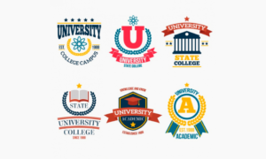
The text is enclosed within a symbol, like car or university shields.
Mascots
Represent the company through an animated character or figure.

Abstract Logos
Symbols that don’t have a literal representation, like Nike’s logo.

Combined Brands
Flexible integration of symbol and text, which can be used together or separately.
How to choose the right logo type
Choosing the right logo type is crucial for establishing a strong and lasting connection with your target audience. It’s not just about aesthetics; it’s about conveying the right message and properly reflecting your brand’s essence. Here are some steps and considerations to guide you in this process:
1. Understand your brand identity
Before deciding on the logo type, it’s essential to have a clear understanding of what your brand represents. What are the core values of your business? What tone and personality do you want to project? Once you have clear answers to these questions, it will be easier to choose a design that effectively communicates that identity.
2. Evaluate your company’s name
If your company name is unique and distinctive, you might consider a Wordmark Logo. On the other hand, if it’s long, a Monogram or Lettermark may be more effective. It’s crucial that the logo is easy to remember and recognize.
3. Consider versatility
The logo you choose should be versatile, meaning it should look good on different platforms and sizes, from a business card to a billboard advertisement on a major road.
4. Think about evolution
Consider the future. Your brand may evolve, and the logo should be flexible enough to adapt to those changes without losing its essence.
5. Research the competition
Examine the logos of companies in your industry. This will help you understand trends and ensure that your design stands out and isn’t confused with that of another business.
6. Get feedback
Before finalizing your choice, present some options to a select group of people, preferably from your target audience. Their opinions can provide insights you may not have considered.
Common Mistakes and Design Considerations
Let’s look at some of the most common mistakes and essential considerations when designing:
1. Overly complex design
A logo should be easily recognizable and memorable. Overly detailed designs or unnecessary elements can complicate its perception, especially in small sizes. Simplicity is key.
2. Following fleeting trends
While it’s tempting to adopt the latest design trends, it’s important to remember that a logo should be timeless. Trends change, and what’s novel today may seem outdated tomorrow.
3. Incorrect use of color
Color is a powerful element that evokes emotions and feelings. Choosing colors that don’t represent the brand’s personality or using too many colors without coherence can confuse or alienate the audience.
4. Neglecting versatility
The logo should work in various formats and media, from business cards to billboards. It should be scalable and look good in both black and white and color.
5. Ignoring the target audience
The design should be oriented to attract and resonate with the brand’s target audience. Ignoring the preferences and expectations of this group can result in an ineffective logo.
6. Incorrect use of terms: logo vs. logotype
While “logo” is a general abbreviation for any brand symbol, “logotype” specifically refers to brands that incorporate text elements. Confusing these terms can lead to misunderstandings in the design process.
7. Not legally protecting the design
Once the logo is created, it’s essential to consider its registration to protect it from potential copying or unauthorized use. Intellectual property is a valuable asset for any brand.
Logo Trends for 2024
Based on current trends in graphic design, I believe the following types of logos will be popular in 2024:
- Minimalist Logos: Minimalist logos are simple and elegant, focusing on shape and color. This type of logo is ideal for companies aiming to create a sophisticated and contemporary brand image.
- Geometric Logos: Geometric logos use simple geometric shapes to create eye-catching designs. This type of logo is suitable for companies looking to create a modern and futuristic brand image.
- Typographic Logos: Typographic logos rely on typography to create a memorable design. This type of logo is ideal for companies aiming to establish a strong and lasting brand image.
- Abstract Logos: Abstract logos use animation to create a dynamic and engaging design. This type of logo is ideal for companies looking to create an innovative and cutting-edge brand image.
In addition to these types of logos, I also believe we will see an increase in the use of custom and unique logos. Companies are increasingly interested in creating logos that are unique to their brand and stand out from the competition.
Here are some examples of logos representing these trends:
- Minimalist Logo: Airbnb
- Geometric Logo: Spotify
- Typographic Logo: Coca-Cola
- Motion Logo: Nike
Conclusion
Logos are the visual soul of any company, acting as the first and most enduring impression in the minds of the public. Choosing the right one is crucial for conveying the essence and professionalism of your brand. However, once you’ve established a strong visual identity, it’s equally essential to maintain and update your online presence. To delve deeper into how to care for and optimize your website, we invite you to visit our guide on web maintenance reports. Because a strong brand requires not only an excellent first impression but also a consistent and reliable online presence.
Frequently Asked Questions
Is it necessary to invest in a professional logo design?
Yes, a professional design ensures that the logo is unique, recognizable, and tailored to the brand’s needs.
How often should I update my logo?
It depends on the brand’s evolution. However, it’s recommended to review it every 5-10 years to keep it fresh and relevant.
What elements should I consider when designing a logo?
Color, typography, simplicity, and adaptability are essential. Additionally, it should resonate with the brand’s target audience and stay true to the brand’s identity.


